How We Read
LeVar Burton, of Roots and Star Trek: Voyager fame, recently launched a Kickstarter campaign to to get his kid's show, Reading Rainbow, back on the air. It blew through its funding goal, hitting $1 million in pledges on the first day. One of the rewards available for crowdfunding backers is a free subscription to the new Reading Rainbow app, of course -- the way the kids read these days. It's also, not coincidentally, a business model, sold to classrooms on a subscription model to generate a potentially evergreen revenue source.
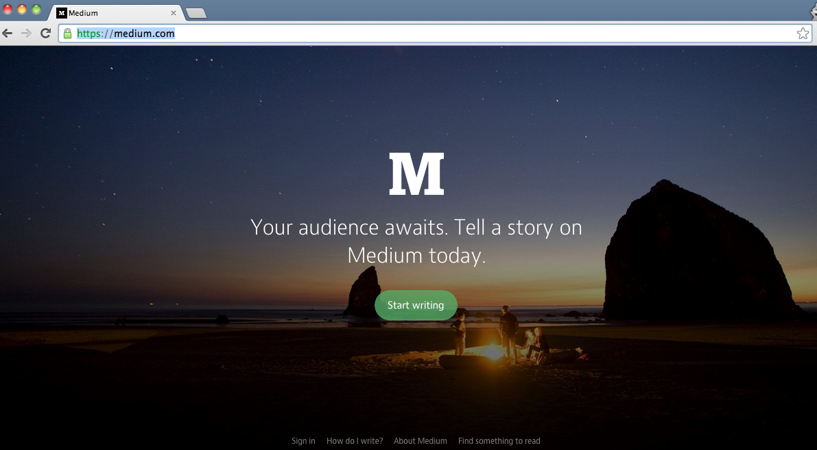
I've been absent from this blog for a few weeks because of another app, called Medium. Founded by the guys from Twitter, Medium is a long-form "content creation platform" with a "social dimension." It's a blog, connected to your Twitter account, that allows you to both write pieces and follow writers or topics you like to read. I put up two articles, similar to this blog, that present a case study of my Zip Tie Lounge Chair (Pt. 1, Pt. 2).
As with many of these ventures, Medium has raised a hefty amount of money and (as yet) turned no profit. It is beautifully designed and works smoothly, but because of its association with Twitter, the articles tend to be self-selecting for a tech-obsessed audience. Sensational headlines and confessional content do well, threatening to make it a LiveJournal for a new age. But, it's focus on long-form content, and the ability to sort it into collections, makes for a new horizontal sort of browsing experience, jumping from one related topic to another.
Medium homepage. If you login, the homepage appears as a long feed of articles from sources you are following.
Medium joins a host of apps and devices that are trying hard to change the way we read. In no particular order:
-Instapaper: allows you to save pieces from the Internet-at-large to read on your own cloud-connected device of choice
-Flipboard: a "personal magazine" that aggregates news from your friends and around the web and presents it in an intuitive, flip-through interface
-Pulse: captures content from your favorite blogs and presents it in a smooth visual interface
-Google Reader: recently deceased, GR collected news for you and deposited it in your inbox
-Longform: aggregates magazine pieces and essays into a digital digest on your iPad
-The New York Times App: version 2.0 of the Times App comes in the wake of a disastrous internal report that found the Times struggling to understand digital reading
-Kindle Singles: Amazon's foray into cheap downloads for mid-length pieces for their e-reader
-Oyster: like Spotify For Books™, pay $9.99 a month to access a massive cloud of books
-Quartz: adopting a new design language for reading in a web browser, with endless parallax scrolling and "sponsored" content instead of ads
All of these platforms are struggling to define the best way to generate (or capture) content and present it in a beautiful interface. All (some more than others) are trying to extract dollars from these processes, either from the audience or people who want access to the audience. None of them are such a demonstrably better experience that they've displaced books entirely.
Rendering by IDEO as part of their Future of the Book project.
As a reader, these apps interest me tremendously. I read little-to-no fiction, but consume a wide variety of blogs, magazines, books, and content from websites. I read on Flipboard, Medium, Longform, through my web browser, via ebooks, and out of physical media, be it the Weekly City Paper, an old-fashioned copy of the New Yorker, or some seventies-era design manifestos.
As a writer, however, I am interested in three things: blog posts here, how-to tutorials, and longer-form narrative articles about art and design. Those have come together in the form of a book, due out next year. That will be released in physical form, as well as about half-a-dozen e-book formats (an issue that needs to be resolved across the industry) to the general public. Two questions I keep running up against are durability and format.
Durability is difficult. Books have survived thousands of years as paper constructions. As we all know from the music industry, and later film and video games, formats come and go, taking titles to the grave with them. One solution is to release them to the web, where nothing really ever dies and the content is laid out for apps to hoover up and distribute to their readers. But even the internet is a rat's nest of dead links, ghost sites, and sunsetting companies. Physical books are salable, sharable, and able to be toted into the workshop for step-by-step help, but are subject to distribution woes, copyright issues, and publisher's whims.
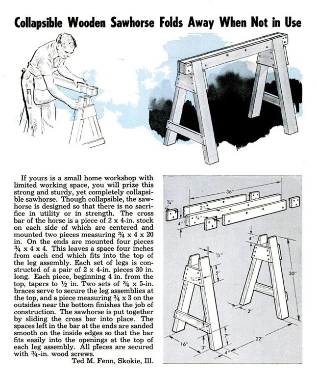
Format is even harder. What is the best way to communicate DIY tutorials? As a design problem, that has been historically handled by manuals. Written in simple language, illustrated with drawings or photographs, everything from Army Field Manuals to Chilton Auto Repair books have allowed amateurs to easily execute complex tasks. New entries in the field like Instructables and iFixit are trying to build a better format, combining photos, writing, annotations, GIFs, and video content for comprehensive documentation. YouTube has also stepped somewhat into the breach, breeding a successful network of DIY videos by dozens of independent personalities.
OG DIY writing from Popular Mechanics, ca. 1960. Via Retro Ramblings.
I don't know what the answer is: how things will evolve, what will last, or how best to communicate what I have to say. But, compared to times past, we do have an unprecedented number of platforms on which to speak. This is a golden age for all types of communication, one that will only deepen and extend as broadband and wireless access reach more and more people. Formats may fade, or web publications fold, but it seems prudent to push out ideas in as many places as possible and hope that some stick around.
As my own thinking on DIY writing evolves, I will continue to look for new and powerful ways to present it. Delivery systems are powerful, but only if there's something good in the package.


