Object Guerilla: The Book II
Some time ago on the OG blog, I was pleased to announce the completion of my first manuscript, a DIY guide to the tao of the guerilla designer. Nine months on, I figured it's about time I offered up a little update on the progress of my toddling manuscript as it navigates its way upstream.
Shortly after mailing off a stack paper representing nearly ten years of my work, me and the lady hopped in the car and lit out from Chicago, taking a 5,500 mile road trip through the Southwest. Upon return, we packed our belongings into a remarkably small cubic volume and moved back east, landing in Baltimore, land of pleasant living (and my birth), in August. And then came the edits.
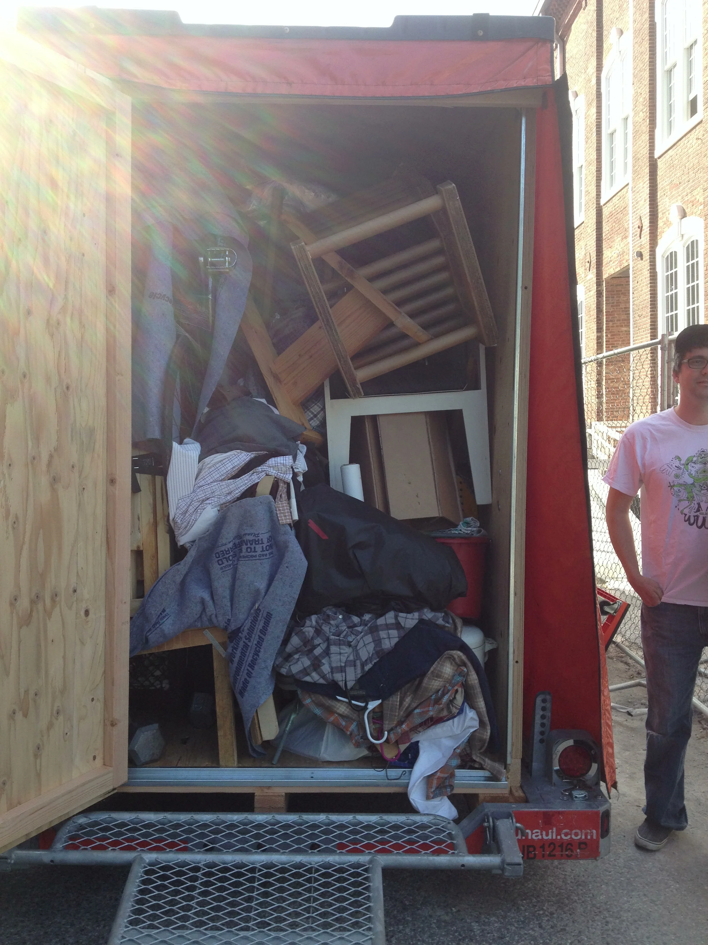
That remarkably small container: still life with guerilla furniture and disheveled winter clothes.
A round of edits for content and clarity was followed by copy-editing, where my internet-wild grammar was ruthlessly tamed into something Merriam-Websterish. That took several painstaking months, guided by the superb, gimlet-eyed DIY author and editor Philip Schmidt. He tightened up the step-by-step instructions, reconciled the illustration lists, called out my inconsistent tenses, and shaped a somewhat rambling narrative into a refined, compact, consistent story. All of that work wrapped up around the holidays, just to make the deadlines a little extra exciting.
All of this time I had known, somewhere, somehow, that all of the projects in the book would have to be documented professionally. I made reference sketches of each piece for the illustrator, worked out dimensions, tracked down documentary photographs for furniture that had since evaporated into the ether, and collected pieces that had disseminated amongst friends and relatives as far away as Florida.
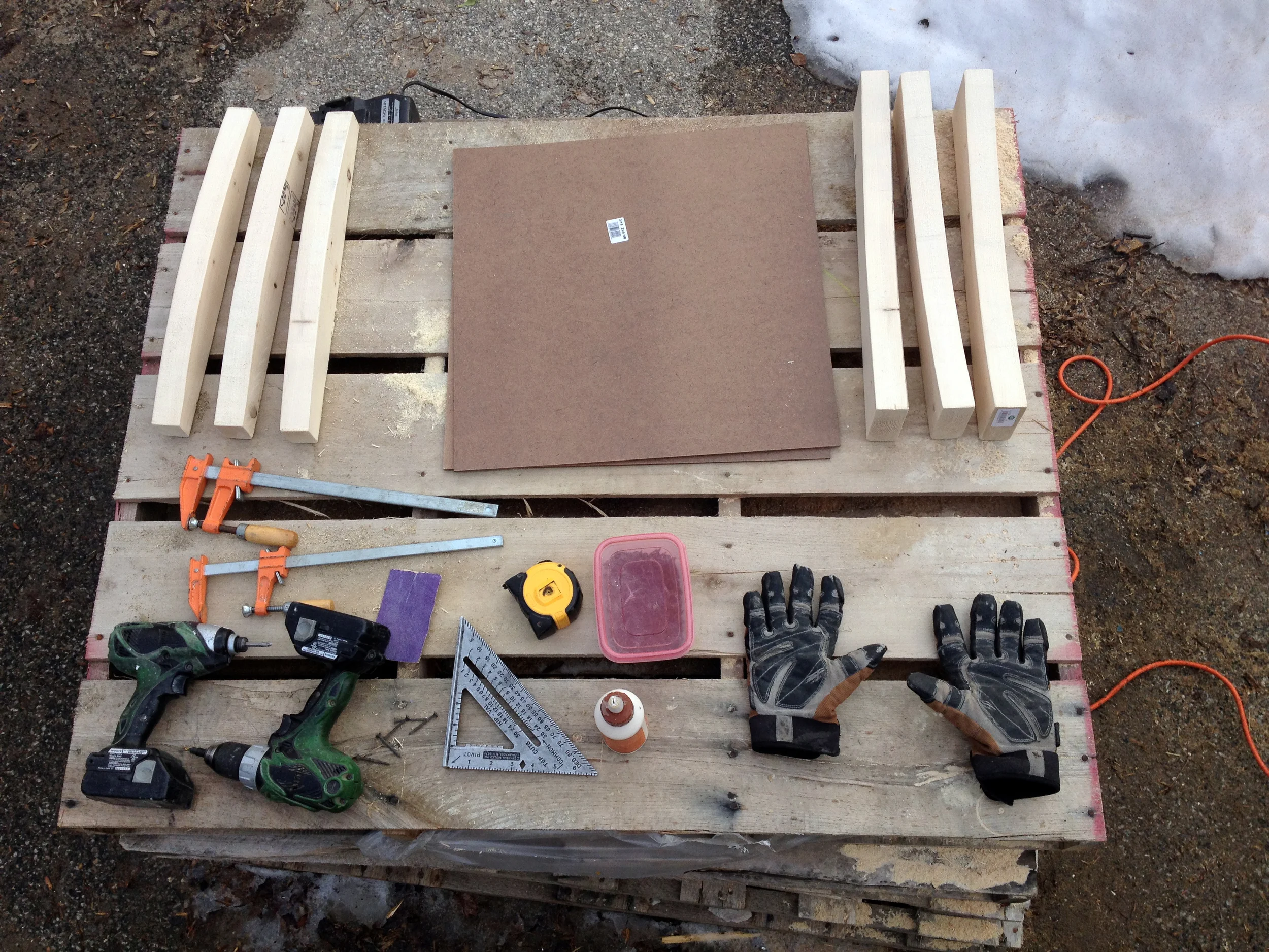
Rebuilding the lost molds for the Cardboard Shell Chair, a uniquely innovative technique profiled in the book. And knolling. Always knolling.
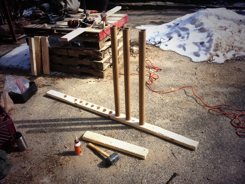
The first time I built a set of Cardboard Tube Screens, I was drowning in my own sweat, August in Alabama.
In the midst of one of Baltimore's coldest winters in recent memory, lacking a workshop, and softened up by a few months of office work, I rebuilt or repaired about a third of the projects in the book. Most of this work, in true guerilla fashion, was executed on a pile of pallets at the foot of my brother's driveway. Along the way, I refined and improved the designs, iterating with an eye towards ease of construction and economy of material.
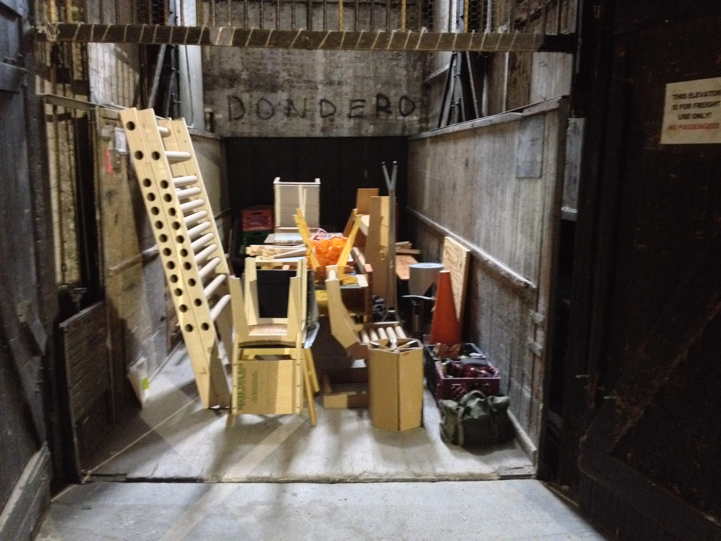
Around the same time, the art director was busy selecting a photographer, a stylist, and a graphic designer. They came to Baltimore on the 18th of March, driving right into the teeth of a late-winter snowstorm. I spent that whole slushy day (with the able help of my buddy Mike) moving the majority of my furniture out of the apartment and into the building where we would be shooting for the first two days. We rode a shaky Depression-era freight elevator to the top floor, raised the gate, exhaled, and called it good.
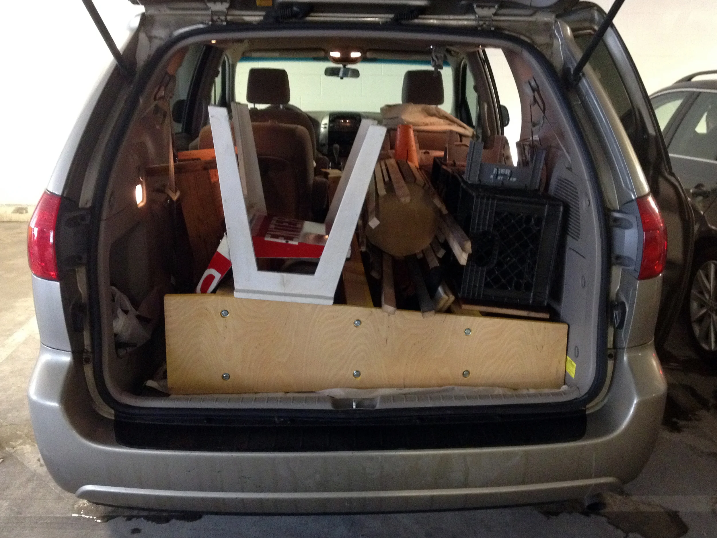
Four borrowed-minivan-loads . . .
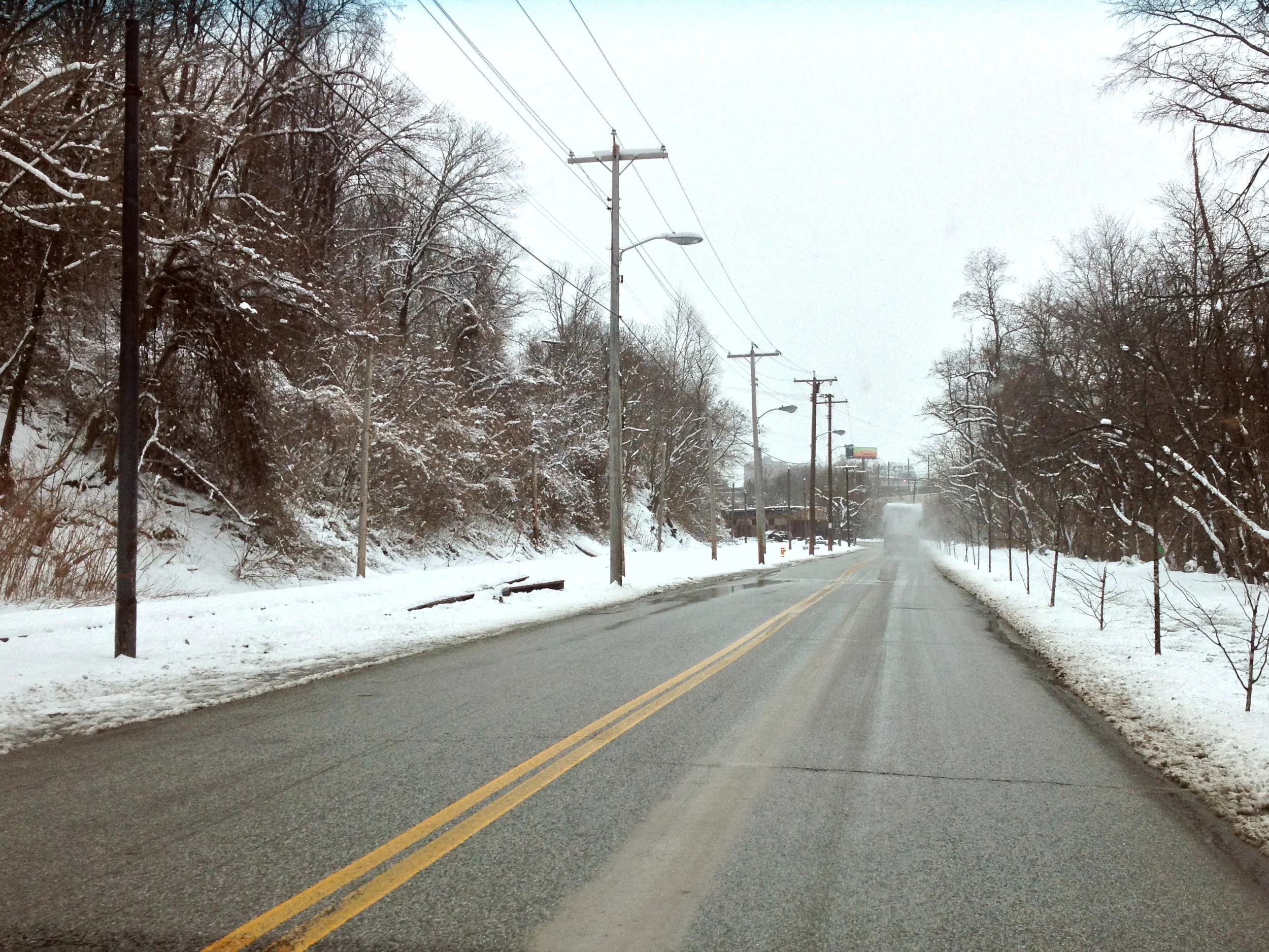
. . . over snowy roads . . .
. . . resulted in a freight elevator full of my life.
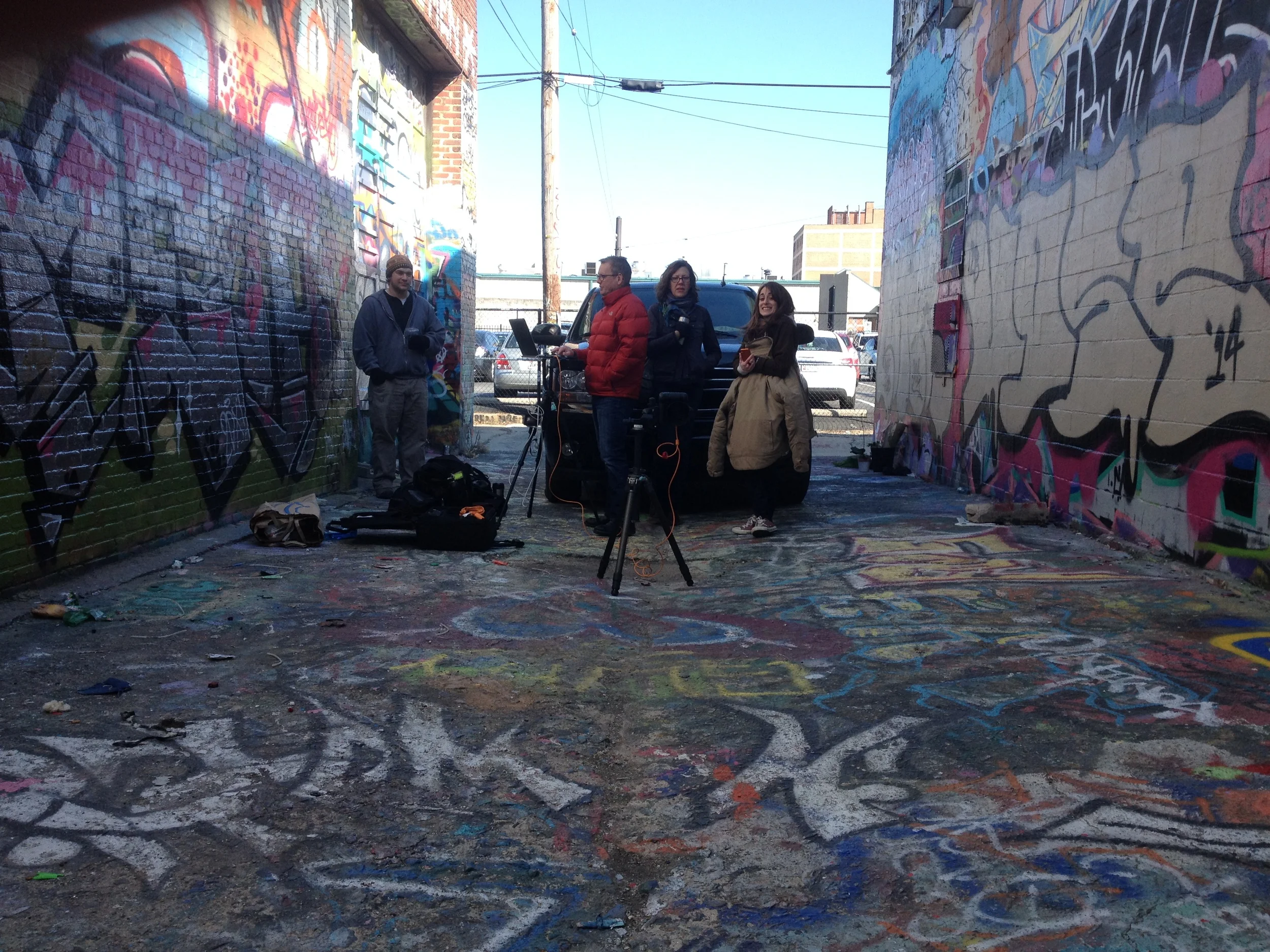
That night, I met the team: photographer Kip Dawkins, his studio manager Marcie Blough, and furniture stylist Neely Dykshorn. Graphic designer Kelley Galbreath joined us the next morning. We hustled an SUV's worth of props and photo equipment through the cold into the building as rush hour streamed ceaselessly by.
The next day, we put in about ten hours, Kip tracking the light across the face of the building with an app on his phone. I temporarily installed a version of my design for milk-crate wall storage on a partition by the elevator, introduced the crew to some excellent local coffee, fed parking meters, and generally tried to make myself useful despite my lack of any technical knowledge concerning photography.
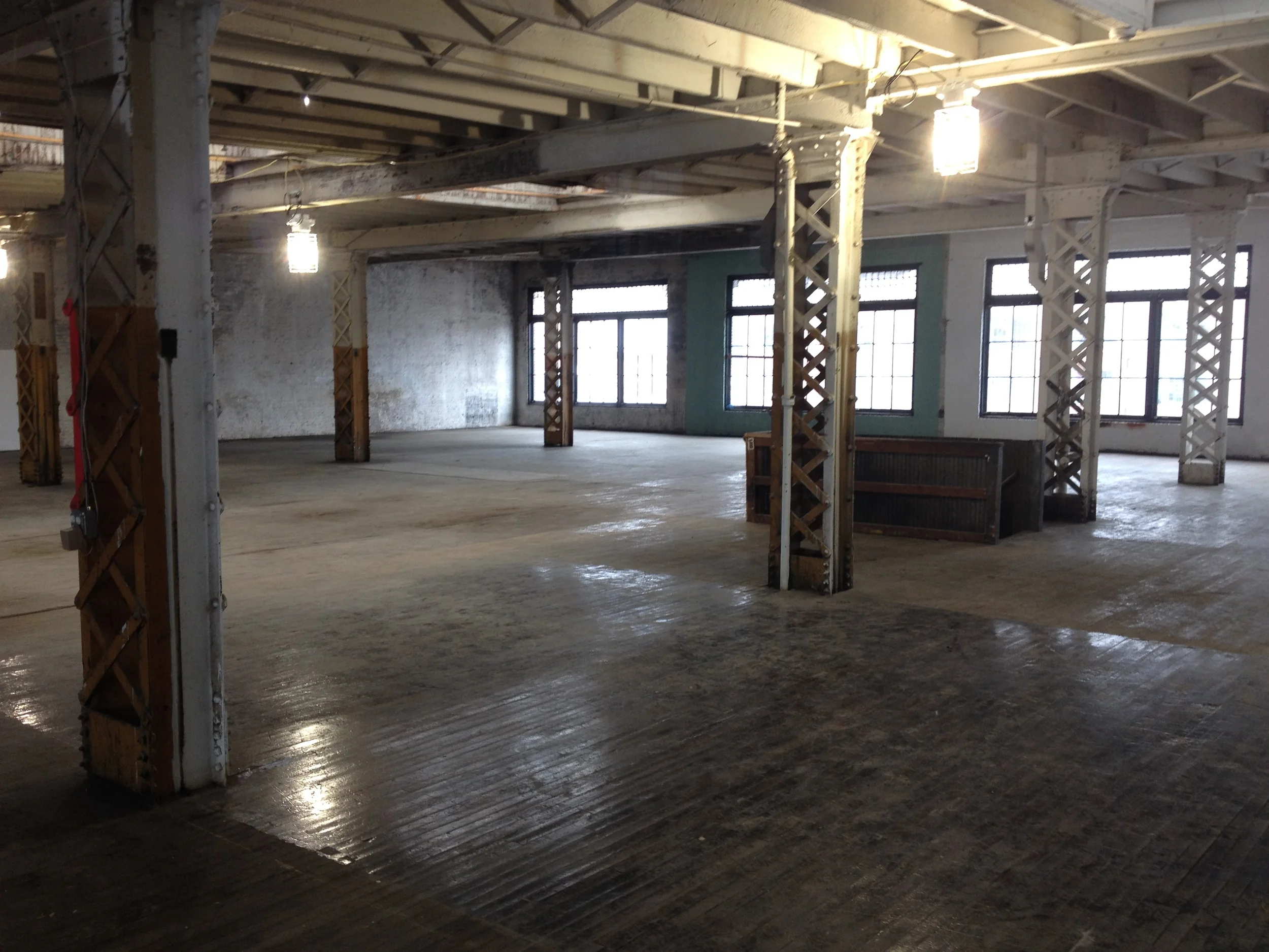
The backdrop for the first few days, an old building currently under renovation by the good folks at the Robert W. Deutsch Foundation.
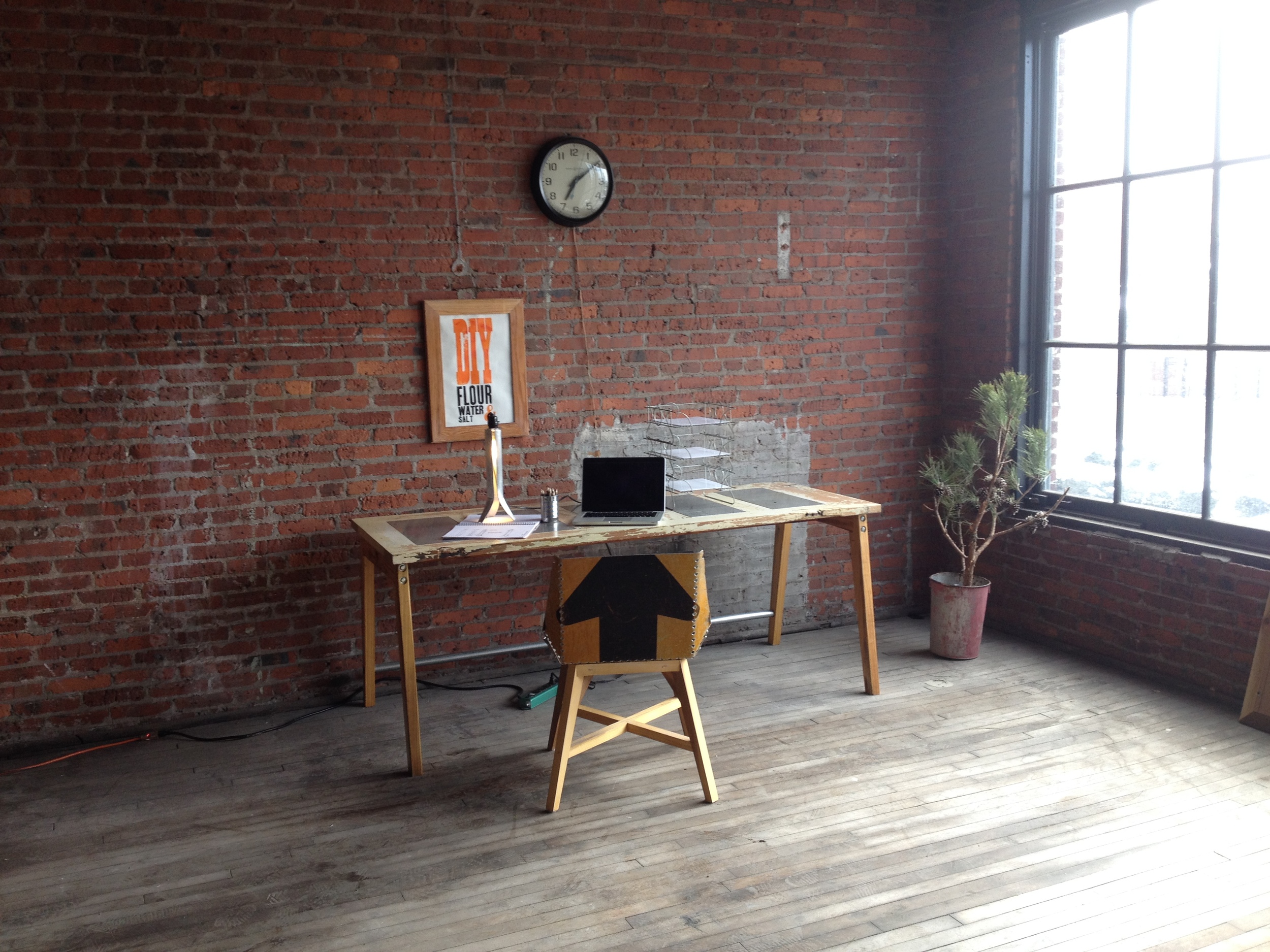
The first shot: Door Desk.
The whole experience dipped swiftly into surreality for me, surrounded as I was by furniture I had worked on for years -- salvaged, sweated over, wrenched into something useful -- then lived with daily, divorced from its context and re-imagined. At times, I was asked to inhabit the photos, either as a "model" (I use that term loosely out of respect for beautiful people) or doing something active, like showing an assembly process. Repeating something I had done thousands of times before suddenly made me self-conscious, aware of all the little flaws in my work, the bad habits embedded in my technique, or the cowlick creeping up the back of my head. I had written the script and called in the cameras, but found myself unprepared to act.
It was almost Kafka-esque, minus the evil undertones -- move out of your apartment, put your furniture in a vacant building, style it with carefully edited versions of your own possessions. Experience a ghost version of your own life, a better-looking doppelganger bathed in golden light. Rinse and repeat. Return.
Close your eyes, shake your head, turn around three times, and wonder if anything happened at all . . .
Guerilla in action.
On the third day, with great relief, we moved on to a gorgeous loft space replete with heat, wi-fi, and a working bathroom. It had been used for filming some portions of the hit internet television program (or so the kids tell me) "House of Cards". The relative comfort of the space sped up the work.
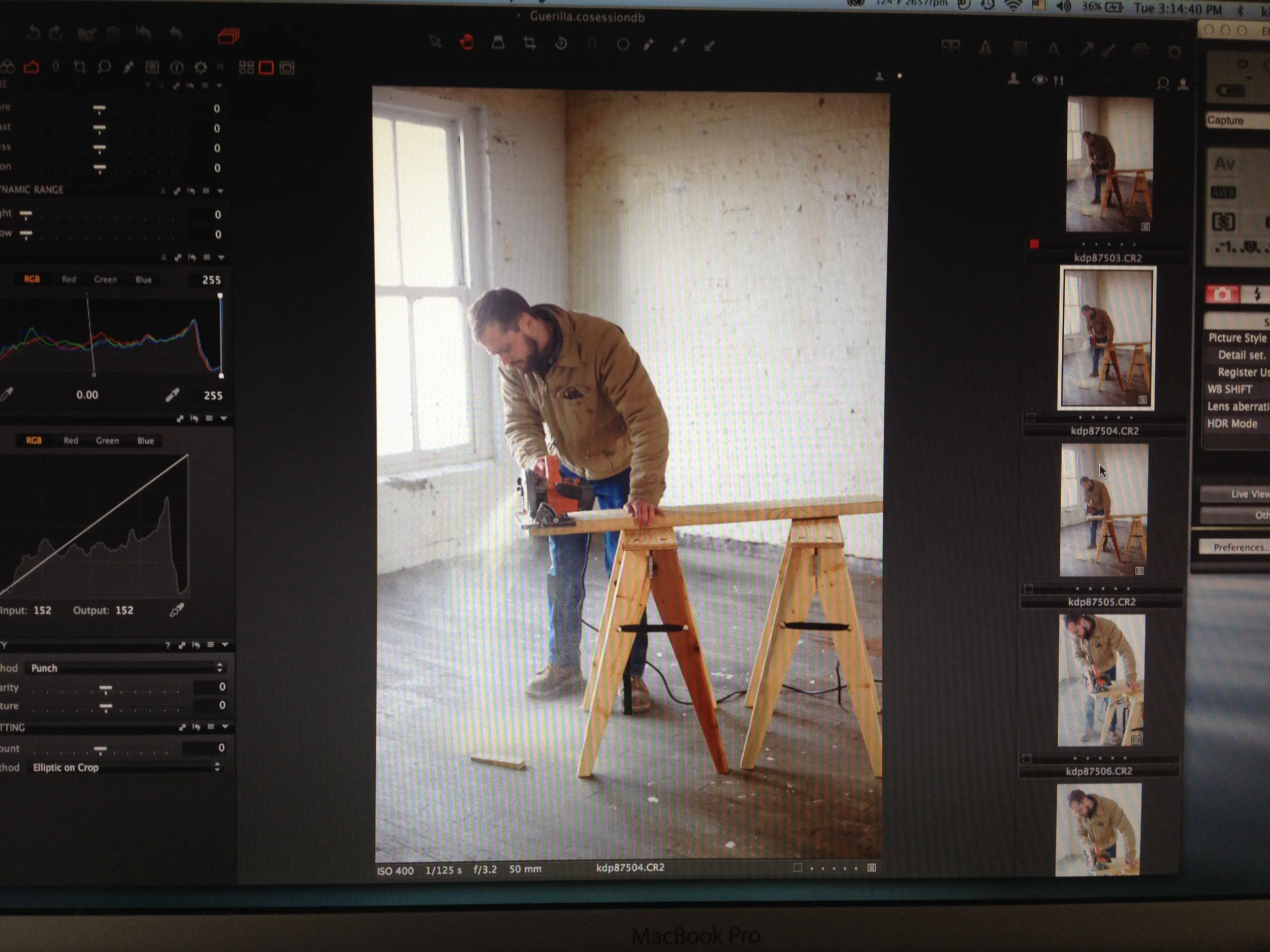
Watching the crew work was fascinating to me. Kip's camera was hooked straight into a laptop, and he could control focus, exposure, and dozens of other variables right from the screen. The files were enormous, crisp, and immediately preview-able. Kelley, Neely, and Marcie quickly composed perfect scenes, concealing the chaos right outside the frame.
As much as I advocate open-source, radically democratic design, this past week really clarified the value of making this book for me. There is real, durable value in a carefully designed and edited piece of work, value that isn't easily replicated by the relentless churning maw of the internet. We so quickly dismiss the value of writing and design these days, as it is so quickly and forgettably consumed, blog after blog, Instagram after Instagram, tweet after tweet, ad infinitum, ad nauseum. High-quality content is not free. It is the product of long-term, painstaking work, just like any good piece of design.
I appreciate the hard work of those involved, enjoyed the process, and look forward to the product.
Me staring back into the void of the camera.
